
When homeowners consider upgrading their property, windows and doors are often evaluated purely on practical grounds: thermal performance, security ratings, draught exclusion. These things matter enormously, of course, but there is another dimension that tends to get far less attention, and that is colour.
The shade of your window frames and doors does not just affect how your home looks. It influences how the whole property is perceived, how well it holds its value, and how cohesive the exterior feels as a complete composition. Getting it right can elevate an ordinary facade into something genuinely striking. Getting it wrong can undermine even the most expensive glazing specification.
First impressions are shaped by colour before anything else
Human beings process colour faster than almost any other visual information. Before a visitor, neighbour, or prospective buyer has registered the style of your windows or the quality of your front door, they have already absorbed its colour. This is not a trivial consideration. Research into residential property consistently finds that kerb appeal has a measurable effect on perceived value, and colour is one of the most powerful levers available.
White uPVC became ubiquitous across British housing in the 1980s and 1990s because it was affordable, practical, and relatively neutral. For many properties it remains a perfectly appropriate choice. But the market has shifted considerably, and homeowners who update their frames to a more considered colour often remark that the whole house suddenly looks more intentional and well cared for, even when nothing else has changed.
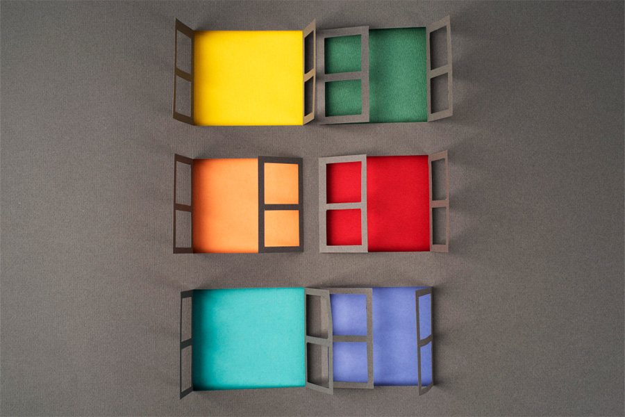
Matching colour to your property’s character
Different property types call for different approaches, and it is worth thinking carefully about what suits your home’s architecture rather than simply following current trends.
Traditional and period properties, Victorian terraces, Edwardian semis, and older farmhouses generally respond well to softer, more heritage-informed palettes. Sage green, slate grey, anthracite, and deep navy all sit comfortably against older brickwork and complement the proportions of sash or casement windows. Stark modern whites or high-gloss finishes can jar against period features in a way that feels slightly off, even if it is hard to articulate precisely why.
Contemporary homes have more latitude. Sleek aluminium frames in black or dark bronze suit clean, geometric architecture particularly well, emphasising the sightlines and giving the glazing itself visual prominence. Contrast is a tool here: dark frames against pale render, or pale frames against dark cladding, can create a bold and sophisticated result.
For those who want to update existing frames without the cost and disruption of full replacement, a professional colour coating service offers a way to completely change the colour of uPVC or aluminium frames to virtually any shade, with a durable factory-style finish that holds up to weathering far better than conventional paint.
The front door deserves particular thought
If there is one element of the exterior where colour can make the most concentrated impact, it is the front door. A well-chosen door colour acts almost like punctuation at the end of a sentence, it draws the eye, defines the entrance, and says something deliberate about the property.
The most enduringly popular choices in the UK tend to be deep, saturated tones: bottle green, racing green, navy, charcoal, and rich black. These colours read as confident and classic without being flashy, and they age well across changing trends. Bolder choices like terracotta, burnt orange, or dusky pink can work beautifully on the right property but require more thought about how they interact with the surrounding brickwork and render.
It is also worth considering the hardware. Door furniture in a clashing or mismatched finish can interrupt an otherwise well-resolved look. Brushed brass works particularly well with green and navy doors; matte black suits contemporary dark frames and charcoal tones; polished chrome tends to pair best with cooler, more neutral palettes.
Colour consistency across the exterior
One of the most common mistakes homeowners make is treating the front door and the window frames as separate decisions rather than part of a unified exterior scheme. Where the two elements are in close visual proximity, which on most properties they will be, a coherent relationship between the colours will always look more resolved than a pair of independent choices that happen to coexist.
This does not mean everything needs to match precisely. A dark anthracite frame can sit very comfortably alongside a deep green door, for instance, because the tones share a similar weight and depth. What tends to look less considered is a sharp contrast between the door and frames with no apparent logic behind it, such as a bright red door against light grey frames on a traditionally proportioned house.
Taking colour seriously when specifying or refreshing your windows and doors is one of the most cost-effective decisions you can make. Unlike structural changes, getting the palette right does not require a significant budget, but the difference it makes to how your home feels from the outside is difficult to overstate.
You may also like
-
How to Compare AU Projectile Sales Before Choosing Supplies
-
Why Every Growing Business Needs a Solid Administrative Foundation
-
What Makes Outdoor Team Building More Effective Than Indoor Workshops
-
Powder Coating Thickness Standards: System Aluminium Windows Manufacturers Guide
-
Why Fairy Tale Costumes Shape Meaningful Childhood Success